


“You want to know the difference between you and me? I make this look good.” An iconic quote from Will Smith’s character in the late 1990s film, Men in Black. Although this line contributes to Will Smith's character arc of smugness and overconfidence, this attitude is admirable when it comes to crafting user interfaces and enhancing the user experience, particularly in the arena of animations.
In this post we’ll talk about why animation matters and some practical foundational tips to maintain best practices when starting to add motion to your web pages.
Why does animation matter?
“Why,” you may ask, “is animation important?” We’ve heard this question before, and it’s a valid one, as there is generally no tangible return on investment for spicing up a loading screen or fading elements in as they appear in your browser. But wait a minute, we’ve got some counterpoints that challenge this line of thinking and hopefully prove the value of adding that extra polish to your project:
One of the most important aspects of any successful product or service is the ability to invoke a feeling within its users or potential customers. This feeling can come in many forms, such as excitement, curiosity, comfort, or inspiration—and it is often what sets a product or service apart from its competitors.
To grab the attention of users and potential customers, it’s important to understand what it is they are looking for and what will resonate with them on a deeper level. By using animations strategically, it is possible to grab the attention of users and create a memorable experience that sets your product or service apart from the competition.
By invoking a strong feeling and grabbing the attention of users, a product or service can establish a loyal customer base that will continue to support and advocate for it over time.
Alright, enough with the value-metric rhetoric. Let's get into it.
How do web animations work?
Web animation works in much the same way as traditional animation seen in cartoons or animated films. Whether an animation is simple or complex, it’s required to define the starting and ending states, as well as the interpolation states (i.e., the calculated states between the start and end of the animation) that smoothly transition between them.
The advantage we have when creating web animations is browsers can calculate all the interpolation states on their own, leaving us only with the task of defining the start and end states, and of course the transition time.
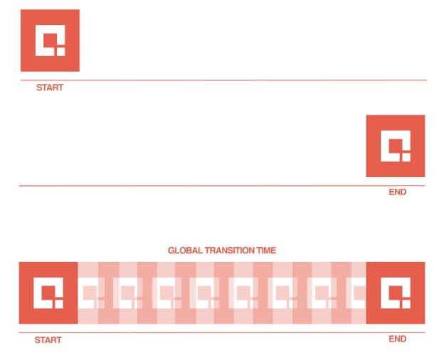
Take, for example, the Credera logo below, which will animate by moving from the left side of the screen to the right side. In this example, we give a starting point as 0% and an ending point of 100%. We tell the browser to transition it based on certain parameters that we can set. Once triggered, the browser will calculate the states in between to generate the animation.

Different ways to animate on the web
When you boil it down, there are only three ways to animate elements of a webpage (not including animated GIFs or video). I won’t do a deep dive on these, but I will give a brief overview of each approach.
CSS transitions: To animate an element with a CSS transition, you only need to specify the CSS properties you want to animate, the end-state, and the duration of the transition. The start-state is determined by the CSS properties the element has before the transition begins.
CSS keyframes: Using CSS keyframes allows for greater control over animation states. Each interpolation state is referred to as a keyframe. CSS keyframes can be easily set to loop either indefinitely or for a specific number of times.
Scripted animations (web animations API): Scripted animations, which are preplanned and pre-coded, provide developers with the greatest amount of control and flexibility over how an animation will play out. This level of control is especially important in complex animation scenarios where precision is key.
Let’s talk performance
The act of scrolling down the page should be more Mercedes-Benz Maybach and less Ford Pinto (I’ve never driven either of these cars, but you get my point). While the average visitor might not consciously notice smooth rendering performance, they most certainly notice its absence.
When a page feels choppy, many developers assume it is simply overloaded with content or burdened with clumsy JavaScript. But here’s the plot twist you might not have seen coming: In many cases, it is actually the CSS preventing the page from hitting that silky 60 frames per second.
Before we jump into the performance optimization pool, let’s first understand the browser’s four rendering steps:
Calculate: In this step the browser determines which CSS rules apply to which elements.
Layout: Here the browser generates the dimensions and position for each element on the page.
Paint: This is when the browser fills in the pixels for each element into layers but doesn’t actually draw those layers to the screen yet.
Composite Layers: In this final step the browser draws the pre-painted layers to the screen.
A browser takes these four steps when it initially loads a page. Our mission as front-end engineers (should we choose to accept it), is to write our CSS in a way that only touches the final step, thus allowing for maximum browser laziness and a jank-free experience.
Repaints, reflows, oh my.
When animating, we want to avoid unnecessary repaints and reflows earlier, but what do these terms actually mean?
Repaints
As might seem obvious from the name, repaints involve refreshing an element’s appearance on the screen without affecting its layout. An example of this would be applying a CSS hover transition to change a button’s background color from blue to red. While this may seem harmless, it is actually triggering a repaint (step three above) and using unnecessary browser resources. The good news is, there are creative ways we can accomplish our transitions without forcing browser repaints. More on that in a moment.
Examples of what triggers repaints: visibility, color, outline, or background.
Reflows
Since we are living in the future, I asked ChatGPT to “describe browser reflows in the funniest way possible,” and let me tell you, it did not disappoint: “Reflows are like that one friend at the party who insists on rearranging the furniture just for fun. So when an element decides to change its height on hover, it's not just causing a ruckus among its pixels; it's pulling a 'Domino Effect' stunt, making its parent and the neighbors below scramble like they're in a comedy sketch, while the browser plays the role of the frantic stage manager, recalculating, repainting, and redrawing the whole comical chaos!” That’ll do robot, that’ll do.
Examples of what triggers reflows: height, width, font-family, or font-size.
So which properties does that leave us with?
There actually aren’t very many CSS properties we can transition or animate cheaply enough in the browser to reliably hit 60 frames per second. As of now, the main tools in our toolbox are translate, scale, and opacity. These properties do not trigger reflows or repaints but instead directly manipulate the composite layers in the browser’s final rendering step.
As I mentioned earlier, there are creative ways to accomplish our animation goals while using the least amount of browser resources. Here are a few examples where you could apply this:
Position: If you want to move an element 200 pixels to the left, instead of slapping on a left: 200px and calling it a day, instead try translateX(200px) which eliminates any repaints or reflows needed and jumps straight to the final rendering step.
Size: If you want to transition an element’s size to say, double its original, instead of directly manipulating height or width use a transform: scale(2) which again, skips any repaints/reflows and goes directly to the final render step.
Color: Jumping back to our earlier example, let’s say we want to animate a button’s background color from red to blue. While the background-color property forces repaints, the opacity property does not. So a simple way to fade between two colors would be to transition one element’s opacity to reveal the underlying color of the second element.
Taking your next step in animation and movement
I hope this helped provide a foundation for animating on the web. The rabbit hole here runs deep, but it’s important to first understand the basics of browser performance and rendering before going any further. Now go forth and create memorable, jank-free web experiences!
Our experience design team works closely with clients to create memorable customer experiences throughout the user’s journey. If you’re like to talk more about how to enhance your customer’s experience online, reach out to us at marketing@credera.com.

Video
Feb 21, 2022
The Credera Brief | Designing For Usability
Credera Partner and experience design (XD) expert Lauren Sheehan shares a high-level breakdown of what it means to design...
Blog
Feb 24, 2021
3 Essential UX Ingredients for Enhancing the Customer Experience
From sprint to software, what do you have to get right in order to deliver a great customer experience (CX) for the...

Blog
Nov 8, 2019
The Unique Value that Research Brings to User Experience
User experience (UX) research refers to the techniques, practices, and methodologies design teams use to deeply understand...

Contact Us
Let's talk!
We're ready to help turn your biggest challenges into your biggest advantages.
Searching for a new career?
View job openings