


This is the fifth and final blog post in a multi-part series on Tableau. In case you missed it, here is part four.
Just perform a quick image search for “Tableau” and you’ll find pages of vividly colored maps—even the pre-made workbooks show off how cool the maps feature can be. Maps in Tableau can be manipulated in a plethora of ways, but the simplest and most intuitive way to customize a map is by altering the color and size of the nodes.
The default color feature works well with categories and grouping (e.g., coloring by region), but coloring by a measure shows some vulnerability with default options. Colors are very vulnerable to outliers, with these extreme values pushing all the color in one direction and thus making comparison significantly more difficult.
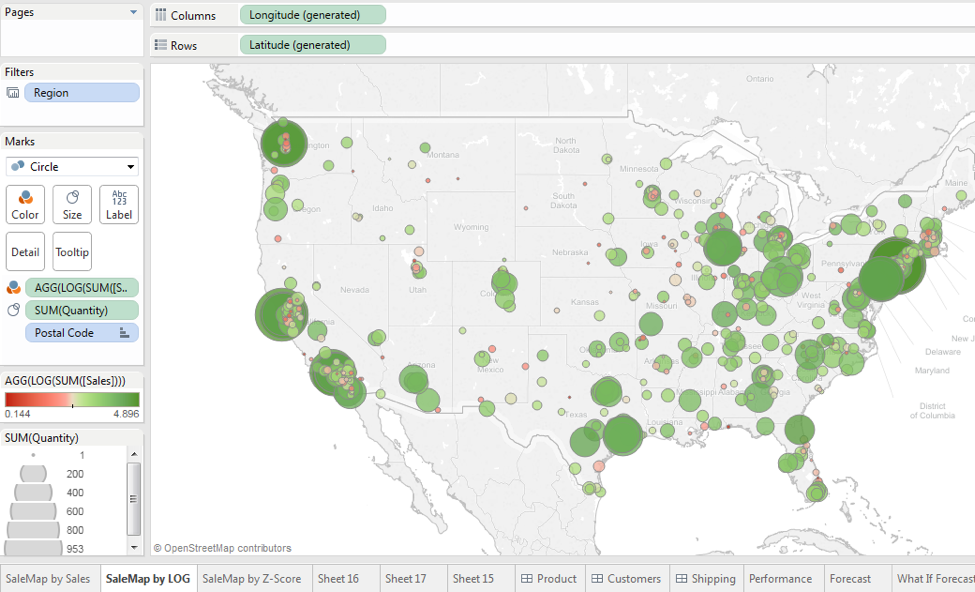
The Superstore map comes colored by profit ratio, but what if this isn’t available? What if we want to compare by number of transactions or just raw profit or sales? Here’s what a switch to coloring by the Sales metric looks like:
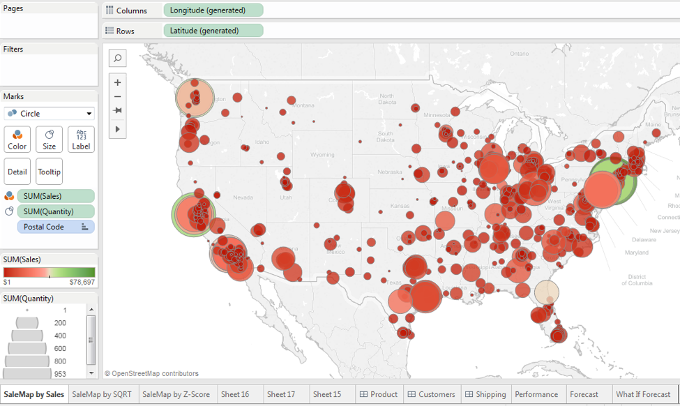

Due to the data being clustered on the low end of the range, this particular visual is not super helpful. To overcome this we’ve come up with a few simple workarounds to help in these situations and make the color feature more meaningful.
What Tableau automatically does is look for a logical center. When there are positive and negative values present in the data, such as there would be in profit data, Tableau chooses zero, which works great in most cases. However, with our sales data, there are no negative values, so our data becomes centered around a value that is halfway between our minimum and maximum value, as you can see below:
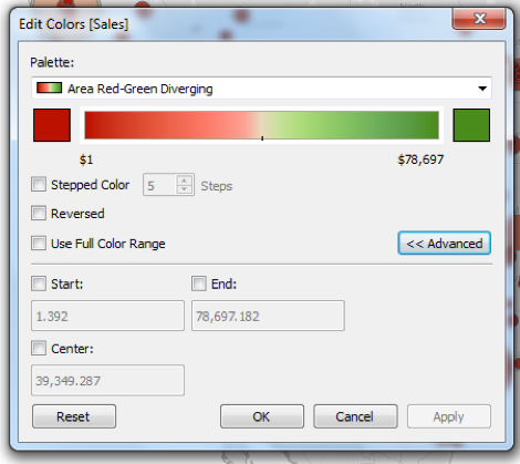
We can alter the start, end, and center, but we’d just be plugging in guesses as to what would look better, which might work for a one-time view. However, if there are any updates to our data, the values may no longer be valid and we’ll have to re-guess each time. A better solution is one that will change with the data.
Option 1 – Transform the Data Using Square Root or Log
Without getting too deep into statistics, taking a square root of the data or log transforming the data are easy ways to stabilize data sets and reduce the effect of outliers.
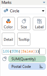
Step 1 – Edit the Metric
Create a calculated field that takes the square root or log of the metric you are using. In the new Tableau 9 it’s made even easier by just editing the calculation in the shelf:
Step 2 – Interpret the Results
We can see that the square root transformation turned out better in our example, but we’re still faced with the same overall problem. We’ve reduced the influence of the outliers, but the center is still just a value in the middle of our minimum and maximum values. Also, we were a little lucky that we didn’t have negative values or zeros in our dataset, which can present problems for square root and log transformations. We should also keep in mind that these transformations also change how we should interpret the colors: a value of 280.5 is no longer $280.50 and is more difficult to explain. However, it does improve our ability to evaluate the performance of regions in relation to others.
Square root transformation results:
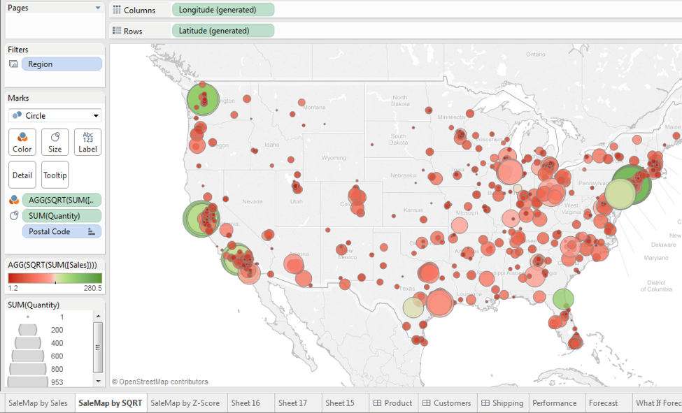
Log transformation results:
Option 2: Color by Z-scores
A more robust and interpretable solution would be to use Z-scores. This option is slightly more involved, but worth it. Again, without diving into statistics, Z-scores represent how far away each data point is from the mean by using standard deviation. This may sound confusing, but the results will be easier to interpret; the mean of our data will be zero, leaving all negative values as below the mean and all positive values above the mean. This is actually really nice because Tableau will automatically read the data and set the center of the color scheme to zero, which now represents the average of all our data.
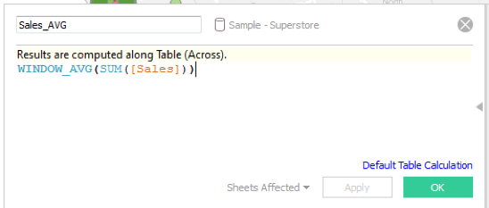
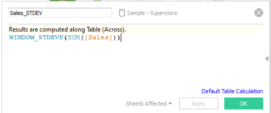
Step 1: Get a Global Average and Standard Deviation
We’ll be using WINDOW formulas, which perform an aggregation based on what is being displayed in the pane or window. We’ll use them to get global averages and standard deviation, which are part of calculating Z-scores.
Create a calculated field for the global average.
Create a calculated field for the global standard deviation.
Next, to calculate Z-scores, create a calculated field that subtracts each data point by the global average we just calculated, and divide the difference by the global standard deviation calculated.
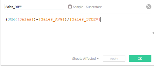
Side Note: In the above formula, you could easily leave in the numerator and take out the denominator. If we don’t divide by standard deviation, what we actually get is mean-centered data where zero will represent the mean and all other values will represent the distance from the mean. Mean-centered data is much easier to interpret than Z-scores since it is the absolute distance rather than a Z-score, but we then lose some other properties. Also, both approaches will return the same results in our map; they’re essentially the same metric but just on different scales. You can choose whatever works best for you.
Step 2: Adjust the Graph
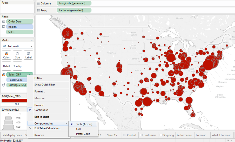
Now drag the Sales_DIFF calculated field to the color mark. You may end up with a graph of all nulls. In this case, we need to set the WINDOW function to aggregate our calculations at the correct level. Change the way Tableau is computing our calculations by right-clicking on Sales_DIFF in the Marks card, and under ‘Computer using’ change from ‘Table (Across)’ to the ZIP code field or your geographic dimension.
Step 3: Interpret the Results
Let’s take a final look at the effect of our transformation:
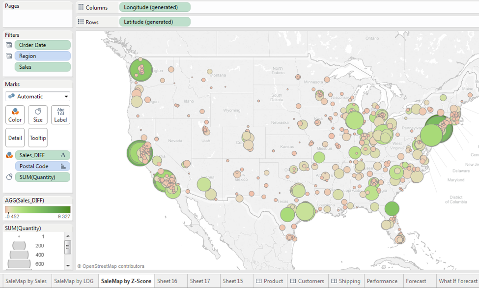
We can see that the graph looks much more even than before. It’s shifted to more green than red, but we can now compare locations much easier. Additionally, we know that any red stores are below average while any green stores are above average. A special benefit to using Z-scores is that we should now also be able to distinguish outliers. With normal distributions, most data lies within two standard deviations, or Z-scores, from zero. In our example above, it’s easy to see that we have data points well beyond our plus-or-minus-two rule and can identify them as outliers. Now, our example does not follow a normal distribution, and there is no guarantee that your data will follow such a pattern. Because of this, the plus-or-minus-two rule may not always be valid, but extreme Z-score values will always signify a large deviation from the mean. We can even exclude them to try to better balance our visualization or add labels to still include Sales in our visualization.
Some transformations may work better for your map, but hopefully some of the options we’ve laid out can help improve your Tableau map while impressing others with your fancy statistical knowledge.
If you have questions about this blog post, please leave a comment below contact us at findoutmore@credera.com. If you need help implementing Tableau, from creating dashboards to setting up Tableau Server, Credera can help you accomplish your goals. We hope you enjoyed our series and learned something along the way.
Contact Us
Let's talk!
We're ready to help turn your biggest challenges into your biggest advantages.
Searching for a new career?
View job openings