


This is the third in a multi-part series on Tableau. In case you missed it, here is part two.
Tableau provides many options on how to customize graphics and views, but we’ve found that getting them to work in unison can be difficult. In this blog post we’ll examine a way to add labels while using color to split our visualization. When a bar chart is split by color using a dimension, we lose the flexibility to add a total label to each bar because the labels merely describe each individual part rather than the whole. Fortunately, there’s an easy method to resolve this.
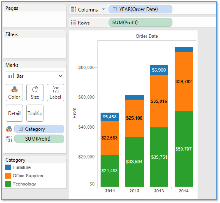
For this example, we used the Superstore data connection to create a simple bar chart. We are measuring profit by year and our bar chart is split by color using product category. We’ve added profit to the label, but again the labels are only applying to the individual pieces. Our goal is to see the total for the year at the top of each bar while still showing the category splits. The image below shows our starting point.

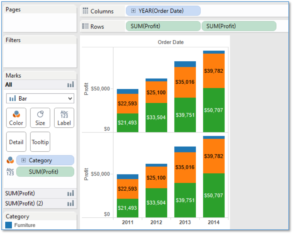
Step 1 – Add Duplicate Pill to Rows Card
In the first step, we’ll add the metric twice to the report. It should appear next to the original pill on rows and you should see a duplicate of your chart appear. As a quick shortcut, clicking on the original pill while holding CTRL will allow you to drag the pill and duplicate it.
Step 2 – Edit Marks Card
On the marks card, open the top metric in the marks pane (SUM(Profit)) and remove the color pill. You should still have the label pill applied.
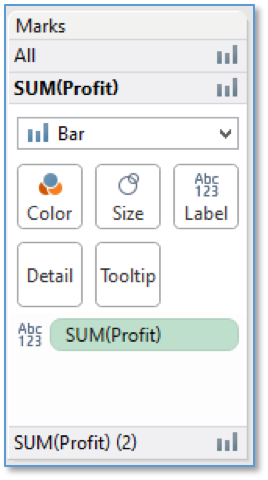
The top chart is now gray and the metric value is showing at the top of the bar.
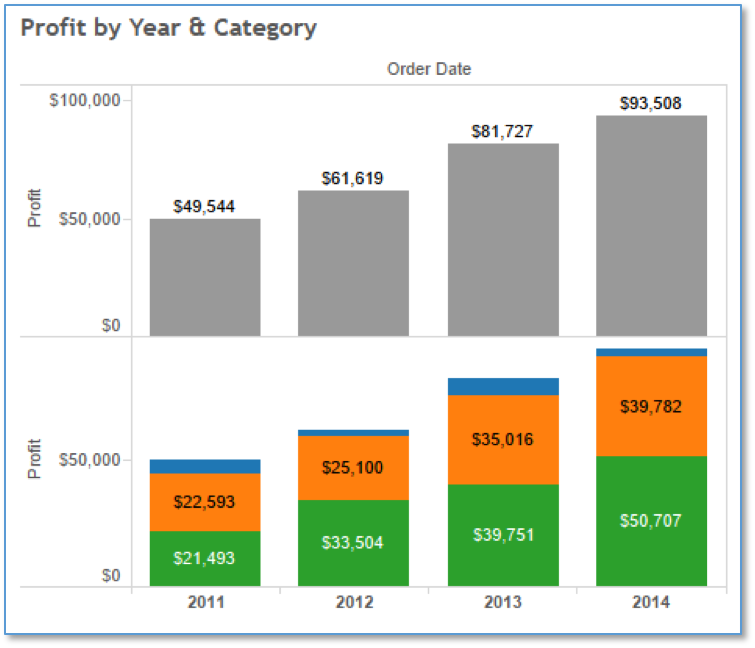
Step 3 – Update the Chart Axis
Right-click the bottom chart and select the ‘Dual Axis’ option. You will see the top axis moved to the right of the chart, and the total overlaying the top of each bar.
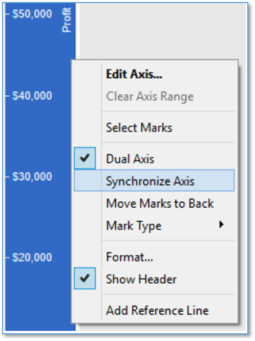
We still need to clean it up a little, so right-click on the right axis and select to ‘Synchronize Axis’.

After you synchronize the axis, unselect ‘Show Header’ on the right axis to hide it, and the total will move to the top of each bar.
We now have a total label at the top of each bar while maintaining the individual labels! At this point, you could also remove the labels from the pieces by removing them from the second marks card.
It’s important to note that tooltip labels are available for only the visualization that is on top. Following our steps will ensure that the total gray bar is behind the colorful bar chart, so tooltip labels for the second metric in the marks card will be available when hovering with your cursor. You can change this by switching which pill is first in the rows card. There is also a ‘Move Marks to Back’ option, but we’ve found that this is more difficult to use when publishing the workbook to Tableau server.
If you have questions about this blog post, please leave a comment below, tweet us @CrederaIT, or contact us online. Remember to stay tuned for the next installment in our blog series, Tableau Workaround Part 4: Accurately Comparing Year to Date.
Contact Us
Ready to achieve your vision? We're here to help.
We'd love to start a conversation. Fill out the form and we'll connect you with the right person.
Searching for a new career?
View job openings