


Predictive analytics is normally handled by data scientists with extensive programming backgrounds. However, with some basic knowledge of Power BI, business analysts and data visualization specialists can also create high value forecasting models. Leveraging a tool such as Power BI can aid tremendously with capabilities available right out of the box, making it easy to go from data intake to advanced analysis.
To achieve even more complex and individualized analysis, other tools, such as R, can supplement Power BI. These tools enable users to extract powerful insights from their data without having to know the intracacies of data science or modelling.
As the world becomes more and more data-driven, it has become increasingly important for business to be able to fully utilize predictive models. Companies like Amazon and Facebook have become industry leaders by using data to make decisions that help their businesses, and with the help of Power BI and R, you too can create insights from data analytics that drive your business forward.
Predictive Analytics Built in to Power BI
Although its primary purpose is data visualization, Power BI contains surprisingly powerful predictive forecasting options, specifically in the area of time series forecasting. Time series forecasting is defined as taking a model that is fit to historical data and using it to predict future observations. That is, predicting what a certain numerical value (e.g., sales or revenue) will be at a specific point in the future.
There are many different statistical models and methods that can be applied in this use case, but with Power BI, the end user doesn’t have to worry about the behind-the-scenes math going on. Instead, they can use one of Power BI’s preexisting visualization tools to quickly build a forecast model and visualize the results. If you’d like to learn more about the math behind the model, we recommend reading this blog post, which goes into detail on the math behind numerous different types of time series models.
For this example, we used the Forecasting TBATS visual from the Power BI store. TBATS is built using complex statistics that calculate future values based on seasonal trends of the current data. Some possible examples of seasonal trends include daily, weekly, monthly, hourly, or even by the minute depending on the data granularity. The seasonal trend is important, as that enables predictions to go beyond just simple linear or logarithmic projections. By using this visualization and selecting one or two different seasonal components, we can predict different trendlines based on our data.
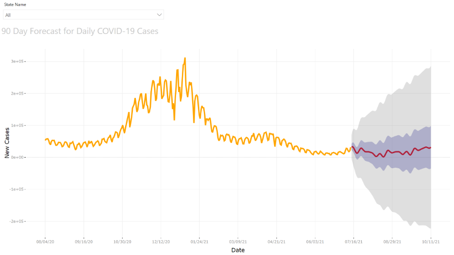

Figure 1: Time series chart showing daily new cases for COVID-19 with 90-day forecast visualized.
Here we can see a predictive time series chart that uses the TBATS visualization in Power BI. TBATS is important, because it incorporates seasonality in the math. The historical data (indicated by the orange line) has some seasonality to it. We can tell because the line is very jagged and appears to move up and down from day to day.
Additionally, it looks like there is a larger seasonality to the trend, as the overall shape of the line oscillates between peaks and troughs over months of time. So when using this specific visualization, we can select these two seasonal factors (daily and monthly) in the options of our visual, which allows the predicted values to follow a similar trend.
At the last historical data point, the line turns red to indicate future forecasted values. The blue area around the red line indicates the Confidence Interval #1, which was set to 0.5 or 50% in this example. This means the statistical model is 50% confident the true value for that date will lie within the blue area. The light gray area indicates the 99% confidence range. The larger the confidence interval is, the wider the predicted range of values will be. All of this allows us to have our time series forecast visualized on top of our historical data
This is an example of one of the multiple predictive analytics capabilities available in Power BI without requiring any additional programming or statistical knowledge that can help you get quick predictive insights from your data.
Using External Tools to Visualize Models in Power BI
Outside of the built-in predictive modeling techniques outlined above, Power BI’s integration with the statistical language R gives users an additional layer of flexibility for accessing insights through visuals and predictive models. R is an open source statistical programming language with many custom packages built specifically for visualization, data cleansing, and predictive analytics. R scripts can be used in Azure ML for heavy data science tasks, but for our purpose, we will focus on how R can enhance PowerBI’s capabilities and how it can be used to create simple but powerful visuals of predictive models.
Power BI provides multiple options for creating visuals with R. For example, you can use R scripts as a source and build your visualization in Power BI, just as you would do with any other data source. Or you can do all of your development and visualization work in R and import visuals directly into Power BI. This is a more technical option as it requires at least minimal knowledge of the R language, but it allows for an extremely customizable visualization experience.
If you want a very specific visual that the Power BI prebuilt visuals just can’t accomplish, R’s integration with Power BI could provide a helpful path forward. For example, one important part of predictive analytics is computing correlation, how closely two variables in a dataset are related. R contains simple functions to analyze correlation as well as great graphics to show the correlation visually. Below is a visual showing how some elements of differing car models are related, including weight, horsepower, and miles per gallon. This graphic displays both the intensity of the correlation, as well as whether the relationship is negative or positive. Charts such as this one are a great reminder of the degree of visual specificity that R gives.
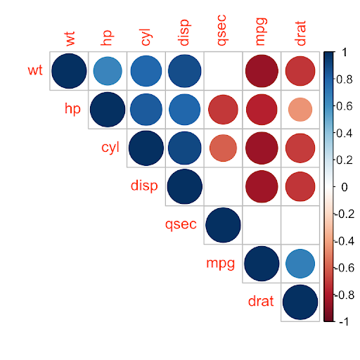
Figure 2: A correlation matrix of various aspect of automobiles visualized using R.
The benefit to importing visualizations into Power BI (as opposed to viewing them in R itself) is being able to take advantage of Power BI’s interactivity. The ability to cross-filter visuals and select subsets of data becomes available when viewing R visuals in Power BI.
Though these tools work great together in the area of predictive analytics, R’s capabilities in Power BI are even broader. For example, Power BI has the ability to use R scripts as a data source, allowing for the cleaning and manipulating of tables before the data is imported to Power BI. Together, Power BI and R provide a strong set of visual tools while only using basic elements of a user’s coding toolbelt.
Predictive Forecasting in Practice
At Credera, use of Power BI and the analytical capabilities covered above has helped us partner with our clients to put predictive forecasting in practice. Credera helped a global medical company create an executive dashboard that would help sales leaders predict their monthly revenue. The goal of this dashboard was to enable executive leaders to quickly and easily see if they were on track for hitting their monthly revenue targets and take action accordingly at any given day in that month.
The client had been using an existing statistical model, which looked at three years of historical sales data across several different features, including location and product categories, to predict how much revenue would be generated each month. The model also broke out the revenue across the number of business days in that specific month, allowing them to easily see the cumulative revenue they should generate each day. This model was updated at the end of each month to include the previous month’s actuals, and adjusted the future predictions accordingly. The updated data was then sent back to their database and pulled into Power BI.
Within Power BI, we created measures based on the predictive model’s output values. These measures were used in the visual to show if revenue for the current month was on track, above forecast, or lagging behind forecast. Because the model also predicted day-to-day revenue forecasts, we added a feature that showed how much revenue needed to be generated on any given day in order to catch back up to the monthly goal.
The end result was an automatically updating dashboard that showed the current revenue for the month as well as revenue projections. This allowed client executives to quickly see whether they were ahead or behind their projections, which features were contributing to this variation, and enabled those executives to act quickly on this knowledge. By removing the guess work and reducing the time required to make these calculations day after day, we helped create a more proactive environment around revenue tracking for the client.
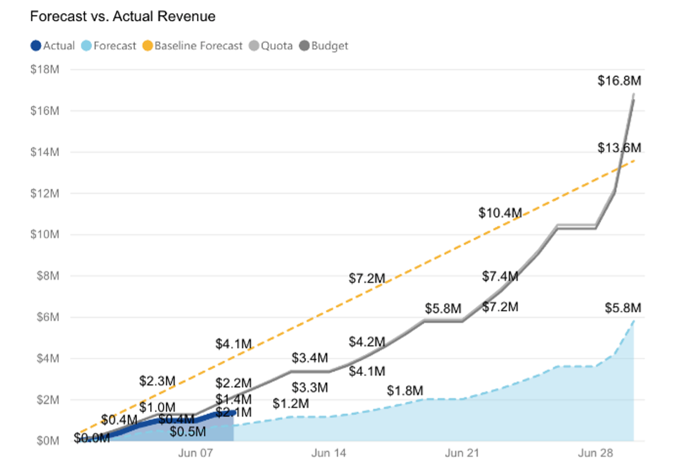
Figure 3: A visualization Credera built to help track revenue over time against the forecasted value.
Growing Your Data Analytics Maturity With Credera
Being able to make smart, data-driven decisions is crucial for a company to stay competitive in an increasingly digital world. Although this task can seem daunting to someone who may not be familiar with statistical modeling, Power BI and R are both great tools to enable everyday users to quickly build useful and actionable insights from their data.
If you would like to know more about how Credera’s data leaders can partner with your organization to implement modern data opportunities, reach out to marketing@credera.com or fill out the form below.


Jul 15, 2021
Level up Your Azure DevOps Reporting Part 1: Creating Analytics Views in PowerBI
How analytics views can expand the capabilities of ADO reporting in order to deepen your insights into your project progress

Apr 29, 2021
NoSQL vs. Relational Databases: When to Use NoSQL
Managed NoSQL databases have the power to free database administrators from various tasks like capacity planning and...

Feb 19, 2021
Realizing Value From Your Data Lake: Lessons Learned and Four Critical Mistakes to...
Data lakes are a great way to organize your company’s data, but a staggering number of data lakes fail to reach their true...


Contact Us
Let's talk!
We're ready to help turn your biggest challenges into your biggest advantages.
Searching for a new career?
View job openings