Technology
Jun 03, 2020
Creating Better User Experiences for Your Mobile App: Mobile Strategy Series Part 2


When you hear the words user experience (UX), what comes to mind?
The look and feel?
Navigation and user flows?
Branding, icons, and other graphics?
Animations and transitions?
Each of these components are needed to craft the best UX for better and therefore memorable and meaningful interactions. Let’s take a closer look at what technology, design, and analytical considerations are important for creating an engaging experience.
Make User Interactions Meaningful
One way to describe a great user experience is: you will know it when you see it. Great UX is mostly about how you make the user feel, often in intangible ways. Having a short learning curve, optimizing for the most used features and functionality, and limiting barriers to accomplishing goals all contribute to a meaningful user experience.
First Impressions are Key
We’ve all heard the saying, “You never get a second chance to make a first impression.” With mobile apps, it’s no different. According to a study from Localytics, 25% of users abandon apps after one use. That’s a jarring statistic. Some of the contributing factors include:
A poor onboarding experience
Slow screen loading times
Asking for too much information upfront
In order to combat these pitfalls, you should aim to have an app that’s intuitive, responsive, and not overwhelming.
Reduce the Cognitive Load for Your Users
Your users value their time and so should you. Your goal should always be to make app interactions as quick and simple as possible. Don’t show two screens when you can get the job done in one. However, be careful about how much you put on one screen. A mobile device has limited real estate, and the last thing you want to do is frustrate your users by making it difficult to click on small elements or forcing them to scroll forever.
Only add design elements that are necessary, and make sure they are as engaging as possible. Cluttering your app with rarely used features will cost extra development time and money, gives no additional value to your app, and increases maintenance costs.
One way to identify where you should spend your development time is by creating user personas. A persona is a mock user that inhabits the traits of your target audience. You can have multiple personas to develop new features and journeys against. If you feel like new features and interactions would not give value to those personas, then it might be best to shift your focus elsewhere.
Design for the Platform
Design your apps for the specific platform that they will run on to reduce the learning curve and barrier of entry to the app. iOS and Android users have different interface guidelines for app navigations, controls, and look and feel.
This doesn’t mean you’ll need to sacrifice your branding to make your app look like Apple’s or Google’s or have alternate user experiences for each platform. Instead, design the application so that you are not fighting the guidelines while maintaining your own branding. Some common questions we ask ourselves are:
Does the app have a clear focus on the home screen?
Do the app components like lists, images, and cards look up to date for the platform?
Have we accounted for the appropriate navigation gestures (long press, swipes, taps) on each platform?
Have we accounted for “Back” button functionality on Android, and is it similar to the navigation bar in iOS?
Will the user understand that this is your brand immediately?
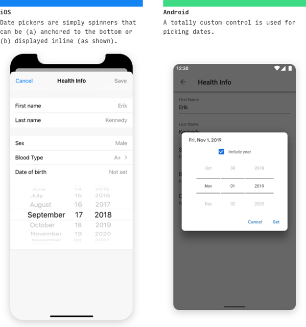

Image source:learnui.design
Create Consistent Experiences Across Web and Mobile
Consistency is a fundamental principle of design strategy. It improves brand loyalty by offering a consistent experience that the user will identify with. It helps to use the same fonts, colors, and imagery across your web and mobile apps, so users connect with your brand.
Not all web functionality can be squeezed into your mobile app. Mobile devices have a different amount of real estate to work with and different technologies available. The goal here is to try and make the user experience as consistent as possible across channels but focus on what the channel needs most.
Guide Users by Signifying Feature and Content
Make sure that the most important elements of a screen stand out. You can achieve this by using appropriate fonts in the form of weights, sizes, and colors. The most valuable content should be the first thing the user notices.
Don’t make your default font so small that users have a hard time reading it and design your application so the fonts can be increased through the phone’s accessibility settings.
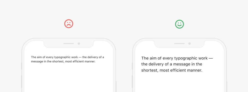
Image source: uxdesign.cc
Use Animations and Transitions
Users enjoy fun animations and transitions that fit your brand. If a specific part of your app takes longer to load, an animated loading indicator or screen shimmer lets the user know their data is being populated. This provides a better user experience instead of looking at an empty screen.
If your app has multiple screens, you can also introduce swipe gestures to transition between them. This will give your app a more animated feel and it simplifies navigation for the user. Another practice is to have modals or one-off flows to not be part of the main navigation stack. You should present these flows from the top or the bottom to let the user know that this is a distinct and separate flow from the one used on your landing page.
Handle Errors Gracefully and Transparently
Inevitably, your user at some point will run into an error. You should let the user know what failed and what they can do to remedy the situation. A generic error message can be irritating to see repeatedly especially when the user has no insight as to what has gone wrong. This poor user experience can potentially lead to low app ratings. To prevent this sort of user frustration, provide steps to mitigate the error. In some situations, it could be as simple as providing a customer care phone number to let the user know that you value their concerns and want to help resolve their issues.
For client-side validation errors, be sure to let the user know immediately when they have entered an invalid value. For example, when filling out a form, don’t wait until the user hits the submit button to show them input errors. Instead, show the error once they leave the input field.
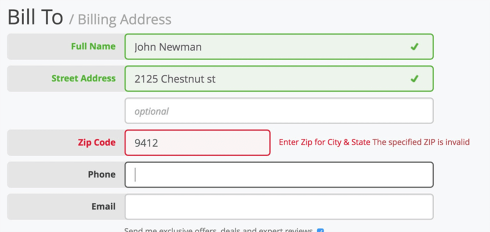
Image source: Baymard
Use Technology to Reduce the Time Needed to Accomplish Routine Tasks
In addition to general design and branding, new platform-specific technologies can also enhance your UX and provide your customers improved experiences by automating routine tasks.
Take Advantage of Biometrics
Most smartphones now come with fingerprint or facial recognition technology. If your app requires a login, allow the user the option to login with their biometric recognition. Nobody likes having to type (or remember) their username and password. The development time for this feature is very minimal, and the advantages are immediate as it reduces the barrier to re-enter your application once setup.
Optimize User Input
Text fields should be optimized for data entry requirements. Launch the appropriate device keyboard (full, numeric, email-optimized) based on the expected data. If you have an input field that only accepts numbers, show the number keypad instead of the standard keyboard. The user will appreciate the fact that you thought about ways to simplify their experience.
If you already have some form of entry data stored, be sure to auto-populate those fields to prevent the user from having to re-enter them. By reducing the amount of input required from your users, you will reduce the number of potential errors and make their experience more enjoyable.
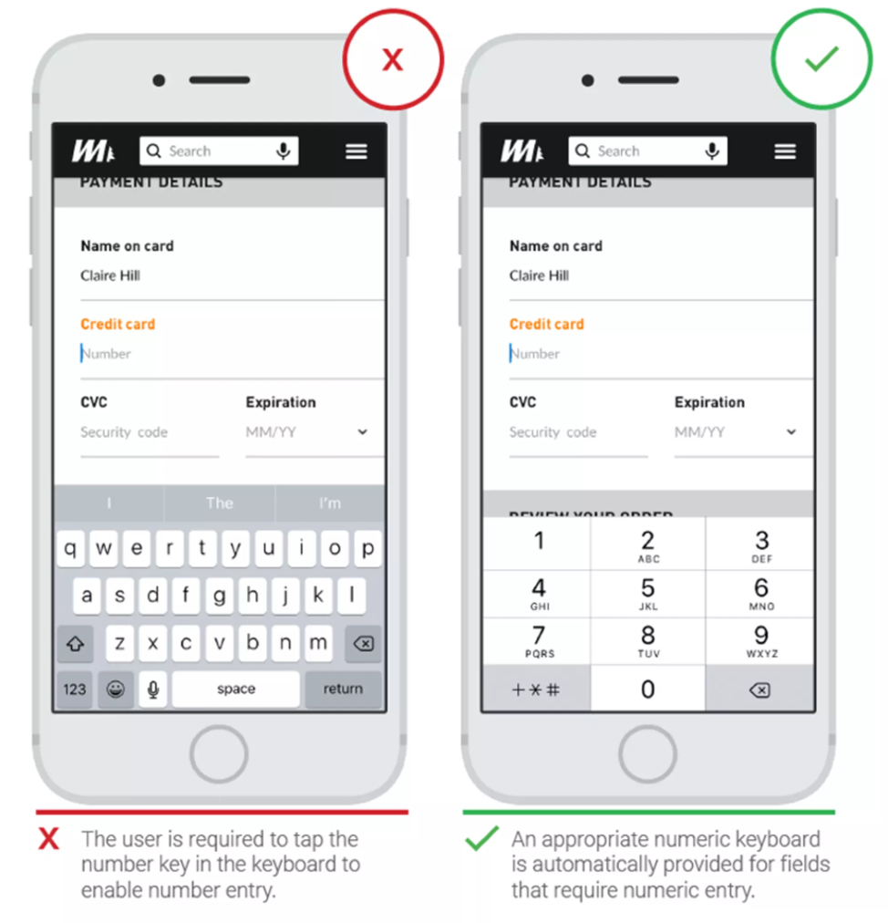
Image source: ThinkWithGoogle
In addition to text-based input, other technologies allow users to reduce the amount of typing or app navigation needed to accomplish an action:
If you take credit card payments, allow users to scan their credit card with their phone’s camera instead of forcing them to manually enter it during the payment flow, or implement the appropriate wallets per platform
UseGPS or beacon services if you have location-based features
Use the phone’s camera and QR scanner to perform quick user actions
Don’t Overwhelm Users with Technology
While we do recommend using native mobile capabilities, technologies like GPS, Bluetooth, and camera access require user permissions and introduce privacy concerns. Some apps overuse these technologies or prompt for permissions in the wrong place. Avoid bombarding your users with system level prompts upon app launch because it’s annoying and will increase the rate of abandonment. In a survey of 501 users, 82%stated that they wanted a clear reason for being prompted for device access.
Our recommendation to managing technology permissions is to include a settings screen in your app that allows the user to toggle their system level options on or off at their own convenience. Another best practice is to prompt the user on an as-needed basis. If your app uses GPS, you can prompt the user for access to their location once they are using location-based features like maps or guidance. Your users will understand the context of this prompt and will be more willing to provide this data.
Test and Measure Through Analytics
After a feature has been released, you still want to keep track of it to make sure it adds the value you expected. Analytics are a very powerful tool in understanding what parts of your app are attractive to your users, and what parts may not be getting the traffic you’d like. Don’t be afraid to perform A/B testing and iterate on different options to get data on what features your users are engaging with, and which ones they aren’t. Analytics can also give insight into what types of users are engaging with specific features. You can use this data to your advantage by creating more personalized experiences for your users.
In order to make sense of the data collected, you should develop a data strategy and naming scheme for the parameters being passed. Other parts of your organization might also be interested in this data, so an omni-channel strategy should be considered.
Continuing the Conversation
Thanks for continuing to follow along with part two on our series on mobile strategy! If you missed it, part one of our series explored 8 Critical Considerations for Developing a Successful Mobile Strategy, and stay tuned for part three where we’ll discuss keeping up with technology and testing.
Need help now? Reach out to marketing@credera.com.
Contact Us
Ready to achieve your vision? We're here to help.
We'd love to start a conversation. Fill out the form and we'll connect you with the right person.
Searching for a new career?
View job openings